플로팅 요소가 포함 된 컨테이너 요소의 높이가 왜 증가하지 않습니까?
높이와 플로트가 어떻게 작동하는지 묻고 싶습니다. 외부 div와 내용이있는 내부 div가 있습니다. 높이는 내부 div의 내용에 따라 다를 수 있지만 내 내부 div가 외부 div를 오버플로하는 것처럼 보입니다. 올바른 방법은 무엇입니까?
 <html>
    <body>
        <div style="margin:0 auto;width: 960px; min-height: 100px; background-color:orange">
    	    <div style="width:500px; height:200px; background-color:black; float:right"></div>
        </div>
    </body>
</html>
플로팅 요소는 컨테이너 요소의 높이에 추가되지 않으므로 지우지 않으면 컨테이너 높이가 증가하지 않습니다 ...
시각적으로 보여 드리겠습니다.
자세한 설명 :
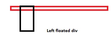
<div>
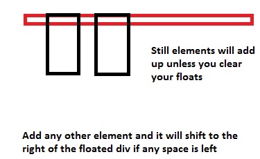
<div style="float: left;"></div>
<div style="width: 15px;"></div> <!-- This will shift
besides the top div. Why? Because of the top div
is floated left, making the
rest of the space blank -->
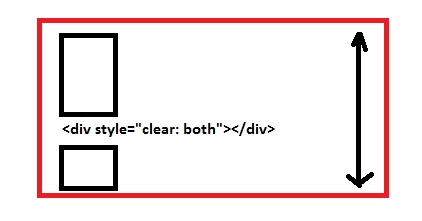
<div style="clear: both;"></div>
<!-- Now in order to prevent the next div from floating beside the top ones,
we use `clear: both;`. This is like a wall, so now none of the div's
will be floated after this point. The container height will now also include the
height of these floated divs -->
<div></div>
</div>
overflow: hidden;컨테이너 요소를 추가 할 수도 있지만 clear: both;대신 사용 하는 것이 좋습니다 .
또한 요소를 스스로 지우고 싶다면 사용할 수 있습니다.
.self_clear:after {
  content: "";
  clear: both;
  display: table;
}
CSS 플로트는 어떻게 작동합니까?
float는 정확히 무엇이고 무엇을합니까?
float속성은 대부분의 초보자 오해한다. 글쎄, 정확히 무엇을float합니까? 처음에는float속성이 떠내려 이미지 주위에 텍스트 흐름을 도입left또는right. @Madara Uchicha 의 또 다른 설명 이 있습니다.따라서
float상자를 나란히 배치 하는 데 속성 을 사용하는 것이 잘못 되었습니까? 대답은 ' 아니오'입니다 .float상자를 나란히 설정하기 위해 속성 을 사용하면 문제가 없습니다 .
데모inline또는block레벨 요소를 플로팅하면 요소가 요소처럼 동작합니다inline-block.당신이 요소를 떠 경우
left또는right의width요소의는하지 않는 한이 보유하고있는 내용으로 제한됩니다width명시 적으로 정의된다 ...float요소를 사용할 수 없습니다center. 이것은 내가 초보자에게 항상 봤던 가장 큰 문제 입니다.float: center;float속성 은 유효한 값이 아닙니다 .float일반적으로float컨텐츠를 맨 왼쪽 이나 맨 오른쪽으로 이동 하는 데 사용됩니다 . 단지가 있습니다 사 에 대한 유효한 값float속성 즉left,right,none(기본) 및이inherit.플로팅 된 자식 요소를 포함 할 때 부모 요소가 축소되면이를 방지하기 위해
clear: both;속성 을 사용 하여 양쪽에서 부동 요소를 지우면 부모 요소가 접히지 않습니다 . 자세한 내용은 여기에서 다른 답변을 참조 하십시오 .(중요) 다양한 요소가 쌓여있는 곳을 생각해보십시오. 우리가 사용할 때
float: left;또는float: right;요소가 스택 위로 하나씩 움직입니다. 따라서 일반 문서 플로우의 요소는 부동 요소보다 스택 레벨에 있으므로 부동 요소 뒤에 숨겨집니다. (z-index완전히 다르기 때문에 이것을 관련시키지 마십시오 .)
헤더, 바닥 글 및 2 열이있는 간단한 2 열 레이아웃이 필요하다고 가정하고 CSS 부동 소수점 작동 방식을 설명하는 사례를 예로 들어 청사진이 어떻게 생겼는지 ...
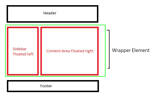
위의 예에서, 우리는 빨간색 상자 만 떠있을 것입니다. 당신은 float둘 다 left할 수 있습니다 float. 또는 둘 다 할 수 있습니다 . left또 다른 right것 역시 레이아웃에 따라 다릅니다 .3 열이면 float2 열일 수 있습니다 left. 받는 하나 right그래서이 예에서, 우리는 간략화 2 열 레이아웃이 있지만, 의존하므로 것 float하나 left와의 다른 right.
레이아웃을 만들기위한 마크 업과 스타일은 아래에 자세히 설명되어 있습니다.
<div class="main_wrap">
    <header>Header</header>
    <div class="wrapper clear">
        <div class="floated_left">
            This<br />
            is<br />
            just<br />
            a<br />
            left<br />
            floated<br />
            column<br />
        </div>
        <div class="floated_right">
            This<br />
            is<br />
            just<br />
            a<br />
            right<br />
            floated<br />
            column<br />
        </div>
    </div>
    <footer>Footer</footer>
</div>

* {
    -moz-box-sizing: border-box;       /* Just for demo purpose */
    -webkkit-box-sizing: border-box;   /* Just for demo purpose */
    box-sizing: border-box;            /* Just for demo purpose */
    margin: 0;
    padding: 0;
}

.main_wrap {
    margin: 20px;
    border: 3px solid black;
    width: 520px;
}

header, footer {
    height: 50px;
    border: 3px solid silver;
    text-align: center;
    line-height: 50px;
}

.wrapper {
    border: 3px solid green;
}

.floated_left {
    float: left;
    width: 200px;
    border: 3px solid red;
}

.floated_right {
    float: right;
    width: 300px;
    border: 3px solid red;
}

.clear:after {
    clear: both;
    content: "";
    display: table;
}
레이아웃을 단계별로 살펴보고 float 작동 방식을 살펴 보겠습니다.
우선, 우리는 주요 래퍼 요소를 사용하여, 당신은 단지 우리가 사용, 그것은 당신의 뷰포트 있다고 가정 할 수 header와를 할당 height의 50px아무것도 공상 그래서이. 플로팅 100%되지 않거나 할당되지 않은 경우 수평 공간 을 차지하는 일반 비 플로팅 블록 레벨 요소입니다 inline-block.
에 대한 첫 번째 유효한 값 float은 left예제에서 사용 되므로 float: left;for 를 사용 .floated_left하므로 left컨테이너 요소의 블록을 플로팅하려고합니다 .
그리고 네, 보시면, .wrapper접힌 부모 요소 는 초록색 테두리로 보였을 때 확장되지 않았지만 맞습니까? 잠시 후에 다시 돌아올 것입니다. 지금은 열이에 뜹니다 left.
두 번째 열로 오면이 열 float을right
여기, 우리는이 300px우리 넓은 열 float받는 right것이가에 떴다됩니다으로 첫 번째 열 옆에 앉아 것 left, 그리고이에 떠이기 때문에 left, 그것은에 빈 거터를 생성 right하고, 공간의 충분한 거기 때문에 right, 우리의 right플로팅 요소는 그 옆에 완벽하게 앉았습니다 left.
여전히 상위 요소가 축소되었습니다. 이제 수정 해 보겠습니다. 부모 요소가 쓰러지는 것을 막는 방법에는 여러 가지가 있습니다.
- 빈 블록 레벨 요소를 추가하고 부동 요소를
clear: both;보유하는 상위 요소가 끝나기 전에 사용 하십시오.이 요소는clear부동 요소에 대한 저렴한 솔루션이므로 작업을 수행하지만 권장하지는 않습니다.
끝 <div style="clear: both;"></div>전에 다음 .wrapper div과 같이 추가하십시오.
<div class="wrapper clear">
    <!-- Floated columns -->
    <div style="clear: both;"></div>
</div>
글쎄, 그것은 더 잘 수정되고 더 이상 축소 된 부모는 없지만 DOM에 불필요한 마크 업을 추가하므로 overflow: hidden;의도 된대로 작동하는 부동 자식 요소를 보유하는 부모 요소에 사용 하는 것이 좋습니다 .
사용 overflow: hidden;에.wrapper
.wrapper {
    border: 3px solid green;
    overflow: hidden;
}
그것은 우리가 필요할 때마다 요소를 저장 clear float하지만 이것으로 다양한 사례를 테스트 할 box-shadow때 자식 요소 를 사용하는 특정 사례에서 실패했습니다 .
데모 (4면 모두에서 그림자를 볼 수 없으므로이overflow: hidden; 문제가 발생합니다)
그래서 지금 무엇? 요소를 저장하지 overflow: hidden;마십시오. 명확한 수정 해킹을 위해 CSS에서 아래 스 니펫을 사용 overflow: hidden;하십시오. 상위 요소 와 마찬가지로 부모 요소에서 class아래를 호출하여 자체 정리하십시오.
.clear:after {
    clear: both;
    content: "";
    display: table;
}

<div class="wrapper clear">
    <!-- Floated Elements -->
</div>
여기서 그림자는 의도 한대로 작동하며 축소되지 않도록 부모 요소를 자체적으로 지 웁니다.
마지막으로 clear플로팅 요소 뒤에 바닥 글을 사용 합니다.
언제 float: none;어떤 사용을 선언 할 수 있도록, 그것은 기본은 그대로, 어쨌든 사용 float: none;?
Well, it depends, if you are going for a responsive design, you will use this value a lot of times, when you want your floated elements to render one below another at a certain resolution. For that float: none; property plays an important role there.
Few real-world examples of how float is useful.
- The first example we already saw is to create one or more than one column layouts.
- Using
imgfloated insidepwhich will enable our content to flow around.
Demo (Without floating img)
Demo 2 (img floated to the left)
- Using
floatfor creating horizontal menu - Demo
Float second element as well, or use `margin`
Last but not the least, I want to explain this particular case where you float only single element to the left but you do not float the other, so what happens?
Suppose if we remove float: right; from our .floated_right class, the div will be rendered from extreme left as it isn't floated.
So in this case, either you can float the to the left as well
OR
You can use margin-left which will be equal to the size of the left floated column i.e 200px wide.
You need to add overflow:auto to your parent div for it to encompass the inner floated div:
<div style="margin:0 auto;width: 960px; min-height: 100px; background-color:orange;overflow:auto">
    <div style="width:500px; height:200px; background-color:black; float:right">
    </div>
</div>
You are encountering the float bug (though I'm not sure if it's technically a bug due to how many browsers exhibit this behaviour). Here is what is happening:
Under normal circumstances, assuming that no explicit height has been set, a block level element such as a div will set its height based on its content. The bottom of the parent div will extend beyond the last element. Unfortunately, floating an element stops the parent from taking the floated element into account when determining its height. This means that if your last element is floated, it will not "stretch" the parent in the same way a normal element would.
Clearing
There are two common ways to fix this. The first is to add a "clearing" element; that is, another element below the floated one that will force the parent to stretch. So add the following html as the last child:
<div style="clear:both"></div>
It shouldn't be visible, and by using clear:both, you make sure that it won't sit next to the floated element, but after it.
Overflow:
The second method, which is preferred by most people (I think) is to change the CSS of the parent element so that the overflow is anything but "visible". So setting the overflow to "hidden" will force the parent to stretch beyond the bottom of the floated child. This is only true if you haven't set a height on the parent, of course.
Like I said, the second method is preferred as it doesn't require you to go and add semantically meaningless elements to your markup, but there are times when you need the overflow to be visible, in which case adding a clearing element is more than acceptable.
Its because of the float of the div. Add overflow: hidden on the outside element.
<div style="overflow:hidden; margin:0 auto;width: 960px; min-height: 100px; background-color:orange;">
    <div style="width:500px; height:200px; background-color:black; float:right">
    </div>
</div>
You confuse how browsers renders the elements when there are floating elements. If one block element is floating (your inner div in your case), other block elements will ignore it because browser removes floating elements from the normal flow of the web page. Then, because the floated div has been removed from the normal flow, the outside div is filled in, like the inner div isn't there. However, inline elements (images, links, text, blackquotes) will respect the boundaries of the floating element. If you introduce text in the outside div, the text will place arround de inner div.
In other words, block elements (headers, paragraphs, divs, etc) ignore floating elements and fill in, and inline elements (images, links, text, etc) respect boundaries of floating elements.
<body>
    <div style="float:right; background-color:blue;width:200px;min-height:400px;margin-right:20px">
           floating element
    </div>
    <h1 style="background-color:red;"> this is a big header</h1>
    <p style="background-color:green"> this is a parragraph with text and a big image. The text places arrounds the floating element. Because of the image is wider than space between paragrah and floating element places down the floating element. Try to make wider the viewport and see what happens :D
        <img src="http://2.bp.blogspot.com/_nKxzQGcCLtQ/TBYPAJ6xM4I/AAAAAAAAAC8/lG6XemOXosU/s1600/css.png">
     </p>
컨테이너 위에 표시 할 div가없는 경우 컨테이너 div에 overflow 속성을 사용할 수 있습니다.
<div class="cointainer">
    <div class="one">Content One</div>
    <div class="two">Content Two</div>
</div>
다음은 CSS입니다.
.container{
    width:100%;/* As per your requirment */
    height:auto;
    float:left;
    overflow:hidden;
}
.one{
    width:200px;/* As per your requirment */
    height:auto;
    float:left;
}

.two{
    width:200px;/* As per your requirment */
    height:auto;
    float:left;
}
-----------------------또는-------------------------- ----
    <div class="cointainer">
        <div class="one">Content One</div>
        <div class="two">Content Two</div>
        <div class="clearfix"></div>
    </div>
다음은 CSS입니다.
    .container{
        width:100%;/* As per your requirment */
        height:auto;
        float:left;
        overflow:hidden;
    }
    .one{
        width:200px;/* As per your requirment */
        height:auto;
        float:left;
    }

    .two{
        width:200px;/* As per your requirment */
        height:auto;
        float:left;
    }
    .clearfix:before,
    .clearfix:after{
        display: table;
        content: " ";
    }
    .clearfix:after{
        clear: both;
    }
이거 한번 해봐
.parent_div{
    display: flex;
}
'Programming' 카테고리의 다른 글
| 두 개의 하위 문자열 사이에서 문자열 찾기 (0) | 2020.05.10 |
|---|---|
| MacOS Xcode CoreSimulator 폴더가 매우 큽니다. (0) | 2020.05.10 |
| URL에서 조각 식별자 (해시 번호 다음의 값)는 어떻게 얻습니까? (0) | 2020.05.10 |
| 주장은 악한가? (0) | 2020.05.10 |
| Mac OS X에서 Android SDK를 어디에 설치합니까? (0) | 2020.05.10 |