인쇄 가능한 Twitter-Bootstrap 페이지를 만드는 방법
Twitter-Bootstrap을 사용하고 있으며 브라우저에서 보이는 방식으로 페이지를 인쇄 할 수 있어야합니다. Twitter-Bootstrap으로 만든 다른 페이지를 잘 인쇄 할 수는 있지만 순전히 Twitter-Bootstrap을 사용하는 페이지를 인쇄 할 수 없습니다. 어딘가에 태그가 없습니까?
인쇄시 공식 TB 페이지 : 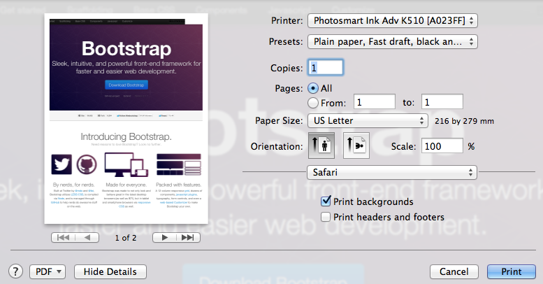
인쇄시 내 페이지 : 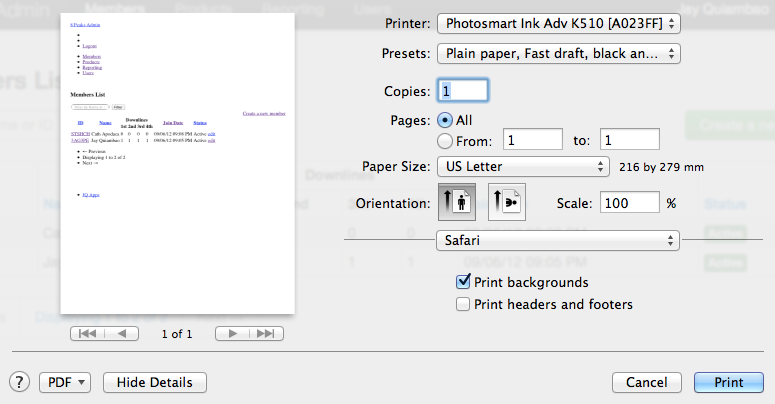
내 페이지의 실제 모습 : 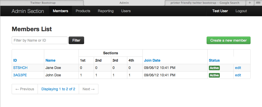
인쇄 할 스타일 시트를 지정하십시오.
별도의 스타일 시트 일 수 있습니다.
<link rel="stylesheet" type="text/css" media="print" href="print.css">
또는 모든 기기에서 공유하는 기기 :
<link rel="stylesheet" type="text/css" href="bootstrap.min.css"> # Note there's no media attribute
그런 다음 별도의 스타일 시트 또는 미디어 쿼리를 사용하여 공유 스타일 시트에 프린터 스타일을 작성할 수 있습니다.
@media print {
    /* Your styles here */
}
부트 스트랩 3.2 업데이트 : (현재 릴리스)
현재 안정적인 부트 스트랩 버전은 3.2.0 입니다.
버전 3.2 visible-print는 더 이상 사용되지 않으므로 다음과 같이 사용해야합니다.
Class                        Browser    Print
 -------------------------------------------------
.visible-print-block         Hidden        Visible (as block)
.visible-print-inline        Hidden        Visible (as inline)
.visible-print-inline-block  Hidden        Visible (as inline-block)
.hidden-print                Visible       Hidden
부트 스트랩 3 업데이트 :
인쇄 클래스는 이제 문서에 있습니다 : http://getbootstrap.com/css/#responsive-utilities-print
Similar to the regular responsive classes,
       use these for toggling content for print.

Class            Browser    Print
 ----------------------------------------
.visible-print   Hidden     Visible
.hidden-print    Visible    Hidden
부트 스트랩 2.3.1 버전 :
bootstrap.css 파일을 HTML에 추가 한 후
인쇄하지 않을 부분을 찾아서 hidden-print클래스를 태그에 추가하십시오 . CSS 파일에 다음이 포함되어 있기 때문에 :
@media print {
  .visible-print  { display: inherit !important; }
  .hidden-print   { display: none !important; }
}
모든 교체 col-md-와 함께col-xs-
예 : 모든 교체 col-md-6에 col-xs-6.
이것은 내가 당신이 대체해야 할 것을 볼 수있는이 문제를 없애기 위해 나를 위해 일한 것입니다.
@media printcss 파일 (Bootstrap 3.3.1 [UPDATE :] ~ 3.3.5) 에 코드 섹션이 있습니다. 이것은 거의 모든 스타일링을 제거하므로 작업 중에도 상당히 선명한 출력물을 얻을 수 있습니다.
지금 @media print은 bootstrap.css 에서 섹션 을 제거하는 데 의지했습니다. 실제로 마음에 들지 않지만 사용자는 직접 화면 캡처를 원하므로 지금해야합니다. 누구나 부트 스트랩 파일을 변경하지 않고 억제하는 방법을 알고 있다면 매우 관심이 있습니다.
다음은 '불쾌한'코드 블록입니다 (192 행에서 시작).
@media print {
  *,
  *:before,enter code here
  *:after {
    color: #000 !important;
    text-shadow: none !important;
    background: transparent !important;
    -webkit-box-shadow: none !important;
            box-shadow: none !important;
  }
  a,
  a:visited {
    text-decoration: underline;
  }
  a[href]:after {
    content: " (" attr(href) ")";
  }
  abbr[title]:after {
    content: " (" attr(title) ")";
  }
  a[href^="#"]:after,
  a[href^="javascript:"]:after {
    content: "";
  }
  pre,
  blockquote {
    border: 1px solid #999;

    page-break-inside: avoid;
  }
  thead {
    display: table-header-group;
  }
  tr,
  img {
    page-break-inside: avoid;
  }
  img {
    max-width: 100% !important;
  }
  p,
  h2,
  h3 {
    orphans: 3;
    widows: 3;
  }
  h2,
  h3 {
    page-break-after: avoid;
  }
  select {
    background: #fff !important;
  }
  .navbar {
    display: none;
  }
  .btn > .caret,
  .dropup > .btn > .caret {
    border-top-color: #000 !important;
  }
  .label {
    border: 1px solid #000;
  }
  .table {
    border-collapse: collapse !important;
  }
  .table td,
  .table th {
    background-color: #fff !important;
  }
  .table-bordered th,
  .table-bordered td {
    border: 1px solid #ddd !important;
  }
}
내가 찾은 최고의 옵션은 http://html2canvas.hertzen.com/
http://jsfiddle.net/nurbsurf/1235emen/
html2canvas(document.body, {
  onrendered: function(canvas) {
    $("#page").hide();
    document.body.appendChild(canvas);
    window.print();
    $('canvas').remove();
    $("#page").show();
  }
});
In case someone is looking for a solution for Bootstrap v2.X.X here. I am leaving the solution I was using. This is not fully tested on all browsers however it could be a good start.
1) make sure the media attribute of bootstrap-responsive.css is screen.
<link href="/css/bootstrap-responsive.min.css" rel="stylesheet" media="screen" />
2) create a print.css and make sure its media attribute print
<link href="/css/print.css" rel="stylesheet" media="print" />
3) inside print.css, add the "width" of your website in html & body
html,
body {
    width: 1200px !important;
}
4.) reproduce the necessary media query classes in print.css because they were inside bootstrap-responsive.css and we have disabled it when printing.
.hidden{display:none;visibility:hidden}
.visible-phone{display:none!important}
.visible-tablet{display:none!important}
.hidden-desktop{display:none!important}
.visible-desktop{display:inherit!important}
Here is full version of print.css:
html,
body {
    width: 1200px !important;
}

.hidden{display:none;visibility:hidden}
.visible-phone{display:none!important}
.visible-tablet{display:none!important}
.hidden-desktop{display:none!important}
.visible-desktop{display:inherit!important}
2 things FYI -
- For now, they've added a few toggle classes. See what's available in the latest stable release - print toggles in responsive-utilities.less
- Bootstrap 3.0에서 제공되는 새롭고 향상된 솔루션-별도의 print.less 파일을 추가하고 있습니다. 별도의 인쇄를 참조하십시오.
인쇄보기를 태블릿 또는 데스크탑처럼 보이게하려면 부트 스트랩을 .css가 아닌 .less로 포함하고 bootstrap_variables 파일의 끝에서 부트 스트랩 응답 클래스를 다음과 같이 덮어 쓸 수 있습니다.
@container-sm:      1200px;
@container-md:      1200px;
@container-lg:      1200px;
@screen-sm:         0;
이 변수를 파일 끝에 넣는 것에 대해 걱정하지 마십시오. LESS는 변수의 지연 로딩을 지원하므로 적용됩니다.
A4 인쇄 (약 540px)에 열을 유지하려면 이것이 좋습니다
@media print {
    .make-grid(print-A4);
}

.make-print-A4-column(@columns) {
    @media print {
        float: left;
        width: percentage((@columns / @grid-columns));
    }
}
다음과 같이 사용할 수 있습니다.
<div class="col-sm-4 col-print-A4-4">
참고 URL : https://stackoverflow.com/questions/12302819/how-to-create-a-printable-twitter-bootstrap-page
'Programming' 카테고리의 다른 글
| 머티리얼 디자인 스타일링 경고 대화 상자 (0) | 2020.06.02 |
|---|---|
| jQuery 유효성 검사 오류 메시지를 지우는 방법? (0) | 2020.06.02 |
| WebStorm에서 기존 파일의 파일 형식 연결을 어떻게 변경합니까? (0) | 2020.06.02 |
| jQuery를 사용하여 드롭 다운의 선택된 인덱스 설정 (0) | 2020.06.02 |
| WPF 텍스트 줄 바꿈 vs. WrapWithOverflow (0) | 2020.06.02 |