TextinputLayout의 레이블 색상을 변경하고 android 텍스트 밑줄을 편집하는 방법
안드로이드 디자인 라이브러리를 사용하고 TextinputLayout있습니다. 그러나 EditText내부 의 힌트 색상, 레이블 색상 및 밑줄 색상을 사용자 정의 할 수 없습니다 TextinputLayout. 도와주세요.
결론 선 색상을 변경하려면 앱 테마에서이를 사용하면됩니다.
<item name="colorControlNormal">#c5c5c5</item>
<item name="colorControlActivated">@color/accent</item>
<item name="colorControlHighlight">@color/accent</item>
자세한 내용은 THIS THREAD를 확인하십시오 .
플로팅 레이블 색상을 변경하려면
<style name="TextAppearance.App.TextInputLayout" parent="@android:style/TextAppearance">
<item name="android:textColor">@color/main_color</item>
다음과 같이 사용하십시오.
 <android.support.design.widget.TextInputLayout
  ...
   app:hintTextAppearance="@style/TextAppearance.App.TextInputLayout" >
업데이트 :
플로팅 레이블이 아닌 경우 힌트 색상을 변경하려면 아래와 같이 사용하십시오.
<android.support.design.widget.TextInputLayout
  ...
    app:hintTextAppearance="@style/TextAppearance.App.TextInputLayout"
    android:textColorHint="#c1c2c4">
@AlbAtNf 감사합니다
Fedor Kazakov 및 기타 답변을 기반으로 기본 구성을 만들었습니다.
styles.xml
<resources>

    <!-- Base application theme. -->
    <style name="AppTheme" parent="Theme.AppCompat.Light">
        <!-- Customize your theme here. -->
        <item name="colorPrimary">@color/colorPrimary</item>
        <item name="colorPrimaryDark">@color/colorPrimaryDark</item>
        <item name="colorAccent">@color/colorAccent</item>
    </style>

    <style name="Widget.Design.TextInputLayout" parent="AppTheme">
        <item name="hintTextAppearance">@style/AppTheme.TextFloatLabelAppearance</item>
        <item name="errorTextAppearance">@style/AppTheme.TextErrorAppearance</item>
        <item name="counterTextAppearance">@style/TextAppearance.Design.Counter</item>
        <item name="counterOverflowTextAppearance">@style/TextAppearance.Design.Counter.Overflow</item>
    </style>

    <style name="AppTheme.TextFloatLabelAppearance" parent="TextAppearance.Design.Hint">
        <!-- Floating label appearance here -->
        <item name="android:textColor">@color/colorAccent</item>
        <item name="android:textSize">20sp</item>
    </style>

    <style name="AppTheme.TextErrorAppearance" parent="TextAppearance.Design.Error">
        <!-- Error message appearance here -->
        <item name="android:textColor">#ff0000</item>
        <item name="android:textSize">20sp</item>
    </style>

</resources>
activity_layout.xml
<android.support.design.widget.TextInputLayout
    android:layout_width="match_parent"
    android:layout_height="wrap_content">

    <android.support.v7.widget.AppCompatEditText
        android:layout_width="match_parent"
        android:layout_height="wrap_content"
        android:hint="Text hint here"
        android:text="5,2" />

</android.support.design.widget.TextInputLayout>
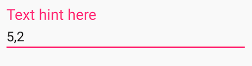
집중 :
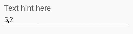
초점없이 :
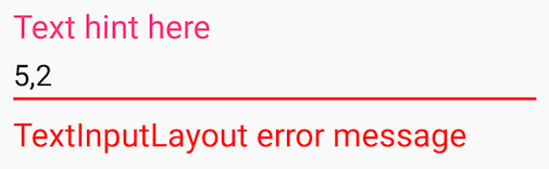
에러 메시지:
This Blog Post describes various styling aspects of EditText and AutoCompleteTextView wrapped by TextInputLayout.
For EditText and AppCompat lib 22.1.0+ you can set theme attribute with some theme related settings:
<style name="StyledTilEditTextTheme">
   <item name="android:imeOptions">actionNext</item>
   <item name="android:singleLine">true</item>
   <item name="colorControlNormal">@color/greyLight</item>
   <item name="colorControlActivated">@color/blue</item>
   <item name="android:textColorPrimary">@color/blue</item>
   <item name="android:textSize">@dimen/styledtil_edit_text_size</item>
</style>

<style name="StyledTilEditText">
    <item name="android:theme">@style/StyledTilEditTextTheme</item>
    <item name="android:paddingTop">4dp</item>
</style>
and apply them on EditText:
<EditText
    android:id="@+id/etEditText"
    style="@style/StyledTilEditText"
For AutoCompleteTextView things are more complicated because wrapping it in TextInputLayout and applying this theme breaks floating label behaviour. You need to fix this in code:
private void setStyleForTextForAutoComplete(int color) {
    Drawable wrappedDrawable =     DrawableCompat.wrap(autoCompleteTextView.getBackground());
    DrawableCompat.setTint(wrappedDrawable, color);
    autoCompleteTextView.setBackgroundDrawable(wrappedDrawable);
}
and in Activity.onCreate:
setStyleForTextForAutoComplete(getResources().getColor(R.color.greyLight));
autoCompleteTextView.setOnFocusChangeListener((v, hasFocus) -> {
    if(hasFocus) {
        setStyleForTextForAutoComplete(getResources().getColor(R.color.blue));
    } else {
        if(autoCompleteTextView.getText().length() == 0) {
              setStyleForTextForAutoComplete(getResources().getColor(R.color.greyLight));
        }
    }
});
Add this attribute in Edittext tag and enjoy:
android:backgroundTint="@color/colorWhite"
If you want to change the bar/line color and the hint text color of the TextInputLayout (what the accent color normally is), then just create this style:
<style name="MyStyle">
    <item name="colorAccent">@color/your_color</item>
</style>
Then apply it to your TextInputLayout as a theme:
<android.support.design.widget.TextInputLayout
    ...
    app:theme="@style/MyStyle" />
This basically sets a theme (not style) to one view (as opposed to the whole activity).
<style name="Widget.Design.TextInputLayout" parent="android:Widget">
    <item name="hintTextAppearance">@style/TextAppearance.Design.Hint</item>
    <item name="errorTextAppearance">@style/TextAppearance.Design.Error</item>
</style>
You can override this style for layout
And also you can change inner EditText-item style too.
<style name="EditScreenTextInputLayoutStyle" parent="Theme.AppCompat.Light.NoActionBar">
    <item name="colorControlNormal">@color/actionBar_background</item>
    <item name="colorControlActivated">@color/actionBar_background</item>
    <item name="colorControlHighlight">@color/actionBar_background</item>
    <item name="colorAccent">@color/actionBar_background</item>
    <item name="android:textColorHint">@color/actionBar_background</item>
</style>
apply this style to TextInputLayout
A TextinputLayout is not a view, but a Layout, as very nicely described by Dimitrios Tsigouris in his blog post here. Therefore, you don't need a Style, which is for Views only, but use a Theme. Following the blog post, I ended up with the following solution:
Start in your styles.xml with
<style name="TextInputLayoutAppearance" parent="Widget.Design.TextInputLayout">
        <!-- reference our hint & error styles -->
        <item name="android:textColor">@color/your_colour_here</item>
        <item name="android:textColorHint">@color/your_colour_here</item>
        <item name="colorControlNormal">@color/your_colour_here</item>
        <item name="colorControlActivated">@color/your_colour_here</item>
        <item name="colorControlHighlight">@color/your_colour_here</item>
</style>
And in your layout add
<com.google.android.material.textfield.TextInputLayout
                android:theme="@style/TextInputLayoutAppearance"
...
With the Material Components Library you can use the com.google.android.material.textfield.TextInputLayout.
You can apply a custom style to change the colors.
힌트 색상을 변경하려면 다음 속성을 사용해야합니다 :
hintTextColor및 android:textColorHint.
<style name="Custom_textinputlayout_filledbox" parent="@style/Widget.MaterialComponents.TextInputLayout.FilledBox">
    <!-- The color of the label when it is collapsed and the text field is active -->
    <item name="hintTextColor">?attr/colorPrimary</item>

    <!-- The color of the label in all other text field states (such as resting and disabled) -->
    <item name="android:textColorHint">@color/selector_hint_text_color</item>
</style>
에 대한 선택기를 사용해야합니다 android:textColorHint. 다음과 같은 것 :
<selector xmlns:android="http://schemas.android.com/apk/res/android">
  <item android:alpha="0.38" android:color="?attr/colorOnSurface" android:state_enabled="false"/>
  <item android:alpha="0.6" android:color="?attr/colorOnSurface"/>
</selector>
결론을 변경하려면 다음 속성을 사용해야합니다 boxStrokeColor.
<style name="Custom_textinputlayout_filledbox" parent="@style/Widget.MaterialComponents.TextInputLayout.FilledBox">
    ....
    <item name="boxStrokeColor">@color/selector_stroke_color</item>
</style>
이 경우에도 선택기를 사용해야합니다. 다음과 같은 것 :
<selector xmlns:android="http://schemas.android.com/apk/res/android">
  <item android:color="?attr/colorPrimary" android:state_focused="true"/>
  <item android:alpha="0.87" android:color="?attr/colorOnSurface" android:state_hovered="true"/>
  <item android:alpha="0.12" android:color="?attr/colorOnSurface" android:state_enabled="false"/>
  <item android:alpha="0.38" android:color="?attr/colorOnSurface"/>
</selector>

레이아웃에 다음 속성을 적용 할 수도 있습니다.
<com.google.android.material.textfield.TextInputLayout
    style="@style/Widget.MaterialComponents.TextInputLayout.FilledBox"
    app:boxStrokeColor="@color/selector_stroke_color"
    app:hintTextColor="?attr/colorPrimary"
    android:textColorHint="@color/selector_hint_text_color"
    ...>
'Programming' 카테고리의 다른 글
| sed 전체 단어 검색 및 교체 (0) | 2020.08.06 |
|---|---|
| Android Studio에서 실행 버튼이 비활성화 됨 (0) | 2020.08.06 |
| git : 한 리포지토리의 커밋에 의해 도입 된 변경 사항을 다른 리포지토리에 적용 (0) | 2020.08.06 |
| 부트 스트랩 : 컨테이너의 너비를 어떻게 변경합니까? (0) | 2020.08.06 |
| 스레드 안전 사전을 구현하는 가장 좋은 방법은 무엇입니까? (0) | 2020.08.06 |